“Stories are relics, part of an undiscovered pre-existing world. The writer’s job is to use the tools in his or her toolbox to get as much of each one out of the ground intact as possible.” —Stephen King
I have a secret for you. There’s a story somewhere in your data; you just need to learn how to tell it.
OK, it may not be the most compelling opening line ever, but it did do something—it offered the chance for something more. What is this secret? Is it really a secret? I wonder…all things that captivate human beings on an emotional level, however fleeting. But why? More appropriately, why does it matter for data? I would argue for two main reasons:
- The reason data makes an impact is because of initial visual cues
- The reason people remember data, the reason is sticks with them, is because of story
In business, we are lucky if we can get number 1. This has to do with things like physical sensation and cognition, pre-attentive attributes and using visual design principles. If you’re interested in this, stop by my talk at this year’s HDI Conference. The second isn’t as easy to pin down. What kind of story is there? How do you want to tell it? What mechanism should you use to tell it? Email? Flat-files? Dashboards? Visual story sequences? These are all things that must be considered in order to effectively tell your data’s story. But first, you have to find the story, so let’s start there.
Join Adam for Enabling the Power of Story with Your Data at HDI 2019 Conference & Expo.
Join us!
Finding a Story in Your Data
Good data stories are not built off reports; they’re built off insights. Anyone can view, print off—and forget—a simple report. To have something to tell besides “Here’s your monthly KPI report,” you need some level of insight with which to create your plot from. But how do you get these? This does have to do with number 1; insights are made easier to see when they’re called out visually. If you do not have this, yes you will have to do some more digging. But regardless of whether something pops out or if you need to make decisions where to dig, you always start with questions.
For example, pick a metric, any metric, to analyze. It doesn’t matter if that metric is screaming something (“Hey! I’m an outlier...figure me out!”) or not (“Hey...I’ve been relatively static for X months now…”). The question will be the same: Why? This is always a good technique to use in consulting. Once I get between three to five levels of “Why?” deep, then I’m really getting somewhere. For example:
“Our FCR KPI metric is great! We’re constantly at 95% FCR over three months!”
So, let’s begin:
- Why is this metric important to you? [Because it shows we’re doing good at FCR]
- OK, but why is FCR important to you? [First call resolution is a measure of how well our techs can solve incidents without follow-up…]
- Why is that important to you (solving incidents without follow-up)? [Because it eliminates effort (supposedly...see some of my other articles on efficiency metrics) on our customers, and because the industry standard is a % our CFO compares us against]
Now we’re getting somewhere. That’s a very big “and” on the last bullet point. So, from this, we’ve discovered that FCR is important. Its importance is related to effort by customers, the metric you compare against is an industry standard, and the reason this is important is because it’s what your CFO cares about.
But is that the real story? No. That’s exposition. Just because something is constant doesn’t mean there’s no story to tell. Looking at the “Why’s” above, we have a good example of the exposition of this metric. Now we have to think about the story we want to tell with it.
Deciding on Your Plot
Now that you’ve decided there’s a good story to tell, we need to think about plot. Let’s say from the above experiment you want to convince your CFO why FCR isn’t the best metric, or why you can’t compare yourself apples to apples to the industry standard, or perhaps even why being constant here isn’t a great outcome (maybe it doesn’t reflect reality of changing IT projects/implementations, where you would expect variations that could drive further insights), but in all of these cases you need some form of development to pull your audience along. If your plot was, “Here’s where we’re at...here’s the change; any questions?” no one would buy your book.
There are many good methods at developing plot. One that I like is Freytag’s Pyramid.
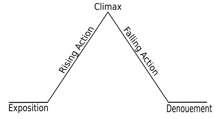
(some examples have the Denouement on a slightly higher plain than the exposition)
So, now that we know the story we want to tell, let’s see how we can apply it to Freytag’s Pyramid. We’ll use a plot of trying to tell why 95% FCR is bad (Which, for the record, I’m not saying it is. But I’m utilizing another writing technique: kill your darlings. So, let’s play devil’s advocate for a second):
Exposition. Introduce the players, setting, and background.
- Here’s our definition of FCR, where it comes from, why it’s important
- Here’s our current staff counts, incident trends
Rising Action. Introduce conflict.
- Despite this constant metric, we feel there are things getting missed
- We did that huge roll-out with no training six months ago, and FCR stayed the same
- The industry standard calls for FCR being defined by first contact, but doesn’t say what that contact method is (email? phone?)
Climax. The point of most tension.
- After doing some digging, we found that the reason FCR stayed the same during this roll-out is because we added five implementation contractors that syphoned off our calls, deflating our percent
- Consequently, we’ve found that true FCR is really measured only if we can get a call in AND solve it on the same call. Anything else—trading emails, logging tickets, and then resolving after categorization calls, etc.—require more effort from our users, and should not count as FCR. Therefore, we want to redefine FCR as X, and add another two categories to account for categorization and email.
- This will require your (the CFO’s) investment because…(and if that doesn’t create tension…)
Falling Action. What happens as a result of the climax, in this case, implementing the changes.
- As a result of implementing the above, we feel...XYZ improvements can be made
Denouement. The conclusion.
- In conclusion…/To summarize…/What’s your decision? etc.
Using the above method, you’re not just presenting some metrics to plead your case. Instead, you’ve set up a natural progression of exposition, tension, climax, and resolution, to help you along. This is almost archetypal in its effectiveness, and so it is a good tool to consider.
Communicating Your Data
Stories are not told in a vacuum. If you mean to lead your audience along in a progression, you need a medium to help enable that progression. “Normal” forms of communication—email, reports, flat files—may suffice for routine delivery and just keeping people up to speed. However, if it’s a story you want to tell to elicit change, you need to be more intentional. This usually requires different techniques and mediums to be effective. Consider the following:
- If it’s decisions you want from your management, you need to do it in person (or at least via web conference). What’s a story without a storyteller?
- So then, who’s the audience? Pay particular attention to not just the decision makers, but also his or her influencers.
- Have you communicated and tested your medium? What technology will you use to visually sequence your story together? If delivering via a web conference, have you tested shifting screen sharing and/or controls. How will you field questions?
- Will this content be distributed afterwards? Do you have a way to track that it is being viewed/consumed afterwards? (This is particularly important to me. Everyone loves to send an email and say they sent it. No one has a clue that anyone opened that file and actually interacted with it. Aside from CYA, what value did this serve?)
Harnessing the Power of Story
Statisticians aside, people forget numbers. This is natural; it’s just not worth us committing them to our long-term memory. If you think of any happy memory from childhood—riding your bike for the first time perhaps—I bet you can’t remember any statistical specifics: pedal revolutions, actual speed, etc. Instead, you remember how it made you feel, what it held for you as an experience. Sure we remember the usual dates and figures (blood pressure, birthdays, anniversaries—hopefully), but I bet you’d need to check to see your MTTR over the past few months. This is because it hasn’t been packaged in such a way as to tell you a story. Seeing data is one thing. Knowing what it means, it’s value, it’s story, and being able to communicate and interact with it is something else completely.
Seeing data is one thing. Knowing what it means, is something else completely.

One technique for communicating data is to visually package it in such a way that you harness and develop the story contained within. There are a number of mediums to help in this effort, but you need to give some thought to getting down through the “Why’s.” Then, once you find that nugget of a good plot, develop it into a story so that it utilizes the natural progressions we’re all attuned to. In doing so, you’ll begin to harness the power of the stories held within your data and unlock the secrets waiting to be found.
Adam Rauh has been working in IT since 2005. Currently in the business intelligence and analytics space at Tableau, he spent over a decade working in IT operations focusing on ITSM, leadership, and infrastructure support. He is passionate about data analytics, security, and process frameworks and methodologies. He has spoken at, contributed to, or authored articles for a number of conferences, seminars, and user-groups across the US on a variety of subjects related to IT, data analytics, and public policy. He currently lives in Georgia. Connect with Adam on LinkedIn.