Date Published February 6, 2018 - Last Updated December 13, 2018
“Consider again that dot. That’s here. That’s home. That’s us.” —Carl Sagan
One of the driving forces behind moving to a mature ITSM suite is usually better reporting capabilities. As we are constantly challenged to do more with less, figuring out ways to generate effective metrics is a huge benefit. All of the popular ITSM solutions offer some form of out-of-box reporting capabilities, most with embedded KPIs that match up either very closely with or are identical to ITIL and HDI best practices. While these are valuable, I would wager that after time they begin to lose their luster.
Sure, it’s important to see and understand why your MTTR shot up last month, but aren’t there better, more unique questions you could ask of your data? These were the same kinds of questions I was asking myself when I took my first leap into creating custom reports. That was when I saw the “pale blue dot,” and all of our ITSM reports were never the same afterwards. This article seeks to outline how you too can approach and enable these same kinds of discoveries.
Sure, it’s important to see and understand why your MTTR shot up last month, but aren’t there better, more unique questions you could ask of your data?

Where to Start?
Before you spend a lot of time digging into custom reporting, you want to ask yourself a few questions about the mechanisms for delivering these reports. This list is not exhaustive, but some of these might be:
- What kinds of questions do I want to ask of my data? If I could see those answers, what would I ask next?
- Does my current ITSM solution have the capabilities to show me the above? If so, is it at an additional cost? What about ease of use?
- Can/should I leverage outside tools and/or resources (do you have a BI department? An external dashboarding software?)
- Do I need to integrate data from other sources outside my ITSM solution? If so, how hard is that?
- Are these custom metrics I envision using over time, or do I just need them here/now? How hard will it be to change or create new ones in the future?
- Who will manage these custom reports and the creation process (and the underlying infrastructure, if any)?
Depending on your answers to these questions, you’ll begin to get an idea of the effort needed to develop custom reports. Remember, custom does not equal complex; sometimes just the ability to change a few views or join tables will pay huge dividends. But you’ll want to have an idea of the what’s and why’s first.
Dashboard Development 101
Once you’ve gone through and answered the above questions you’re ready to start developing. Everyone’s infrastructure is different, so it won’t be valuable to spend time talking technically about using “X” ETL software or “Y” database design. Instead, let’s talk about the process of planning this project and some items to keep in mind throughout the process. I’ve divided development into two areas: project work (things to consider and how to manage your development) and dashboarding best practices (general principles to keep in mind).
Project Work
Like any project, developing custom reports must have a beginning and end date. You need to have a clear understanding of what your stakeholders want and clear expectations of what deliverables each iteration will produce. To help with this, here are a few tips:
Use Mock-Ups...2.0. A lot of times when people attempt to do mockups, what they’re actually talking about is wire-framing: schematically drawing out a concept of what your custom reports and dashboards will look like. This is the absolute wrong way to do mockups. Instead, you want to go in with a blank slate (no, really, walk in with an empty white board). Ask the question, “What keeps us up at night about this data? What insight would we like to see within 5–10 seconds of looking at this data? OK, then that’s metric #1. Now, if we could see that, what’s next? Is it a different level of granularity? A separate but related subject?”
As you begin to answer these questions, draw out your actual answers as “metrics” on your blank slate (thus creating a rough draft of your dashboard). This will ensure you have something of value to work towards, rather than, “The boss want’s a bar chart, and wants it to be red.”
Draw Out Your Data Flows and Table Structure. Whether or not you’re developing your own reports or delegating other teams to do it, you need to have a clear understanding of your underlying data. One way to help with this is to draw out your data flows and table structures. This will help you understand where the answers you’re asking for should come from and what tables/definitions will match up with corresponding reports. You don’t have to be super advanced with it; a simple dry erase board will do.
Iterate. Once you start developing custom reports you’re reaching into newfound territory. You’ll make mistakes, find insights you didn’t plan on, and want to change things in response to these developments. To help with this, make sure you do shorter, iterative work. Put a quick custom report together, get feedback, see if it gives you what you want, see if there’s a better way to do it, tweak it, etc. You still want a project end date and not to scope creep, but doing shorter, iterative work will ensure you get things that are actually valuable and, more importantly, possible.
Dashboard Best Practices
While the ultimate answer to dashboard best practices is “it depends”, understanding some basics early on will take you a long way. The below are just a few simple ideas to keep in mind when developing your dashboards. These rules can of course be broken or amended over time, but for your early stages heed these warnings to deliver effective insights.
Stay Away from Pie Charts. I know, they have their place, and if you only have between 3–5 (max) categories, pie charts can even be effective. However, for very well documented reasons, bar charts are usually better. With a pie chart, even with minimal parts, the brain still has to do extra math (comparing area and angles, etc.). With bar charts, it’s much easier to compare objects along a single dimension (length).
Know When (and When not) to Start from Zero. When I did my first round of custom metrics, I created a metric measuring customer satisfaction on a 1–5 scale (1 being bad, 5 being very satisfied). On average, we were never below 4, which was great! The problem was, if I plot 1–5 on my Y axis (X being over time), then that means that four fifths of my Y axis contains negative space (since, after all, we never drop below 4). This may be great for showing how awesome we are, but it also makes it harder to see the peaks and valleys. Instead, know when to not start from zero for your axis. By moving my starting point from 0 to 4, I could see a lot more detail in the fluctuations.
Approach this one with caution though; the same technique can skew what you’re trying to convey. If I were showing sales, I could adjust my axis to make a $2k month-over-month drop seem huge. But if my sales each month average in the millions, this is a drop in the bucket and probably not worth drawing that kind of attention to.
Get your service management content in person at Service Management World!
Join us!
Worth the Effort?
Hopefully using the above examples will help you begin to think about the why’s and how’s with which you can develop custom reports. It was both rewarding and educational when I went through this process the first time. Instead of relying on out-of-box reporting, with some technical know-how and dedication I was able to create a series of custom reports that provided unique business value to our leadership. Some examples include:
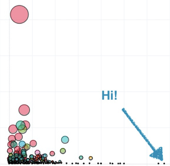
- A scatter-plot graph showing count of incidents by subcategory relative to average time to resolve (this is where I first found the ”pale blue dot”). This showed us if there were training issues we’d like to tackle, ask why certain teams/techs always seemed to tackle or be better at some tickets vs. others, etc.
- A bar graph relating our Changes, Problems, and Related Incidents (those attached to Problems) month-by-month in one view (usually these are coming from three separate tables). This easily showed correlation between implementing changes and downstream problems, with their impact to the users.
- Various reports comparing our environment and response times to industry benchmarks (of course, using HDI data!).
- The average time it took managers to fill out new-hire IT questionnaires (for granting hardware, rights, etc.), showing where bottlenecks and training opportunities were that would normally fall on the service desk’s doorstep.
As I created these reports, I developed a much more in-depth knowledge of the data and reporting mechanisms. As a result, now when my managers have off-the-cuff questions, I know for certain if it’s something I can easily provide or how long it will take to get.
But, I bet you’re still wondering what the pale blue dot actually was. Not to be dramatic; it was nothing. Literally. Not in the Pluto sense (sorry Pluto, you still have a place in my heart), but we realized this outlier was not indicative of some awfully handled ticket or huge area of training. Rather it was a customized field that had been created on the fly and used only once and was now skewing our data. Was this report still valuable to us over time? Absolutely. But it also allowed us to clean up our ITSM definitions, something that is always a plus. Remember: custom reports may payoff in ways you never imagined. This was just one example.
When delving into custom reporting, I’m fond of saying that if you have a decent ITSM solution, you can get hopefully 50–75% of your needed reports from their out-of-the box reporting. However, getting above that threshold should, if you plan it right, pay off with higher dividends. Think of golf. The average difference between the best PGA player and the worst is about three strokes. That means that, for roughly 96% of the time, everyone is the same. But the difference between pay for first place and last place on the tour is literally millions. That’s what the value of truly knowing your environment is. Stepping outside your comfort zone of stock reporting and being able to ask and answer unique questions of your ITSM data can likewise pay off huge dividends. Who knows, you might find something new, unique, and valuable. I certainly hope so. After all, ITSM data-wise, this is the only home you’ll ever know.
Adam Rauh has been working in IT since 2005. Currently in the cybersecurity space, he spent over a decade working in IT operations focusing on ITSM, leadership, and infrastructure support. He is passionate about security, data analytics, and process frameworks and methodologies. He has spoken at, contributed to, or authored articles for a number of conferences, seminars, and user-groups across the US on a variety of subjects related to IT, data analytics, and public policy. He currently lives in Georgia. Connect with Adam on LinkedIn.