Date Published July 24, 2018 - Last Updated December 13, 2018
We all struggle with designing service portals and service catalogs. Designing interfaces that are both pleasant to use and easily navigated is a challenging task. I’d like to walk you through some steps to help get you started and give you some tools to help you along the way.
The user interface (UI) is what your website users see. This includes everything in your design from the colors and layouts to the fonts. The user experience (UX) is so much more than that, and is arguably more important, as it is your customer’s experience at every phase of interaction with your product or site. It’s the way a page is laid out: the load time between pages, the wording and sectioning, 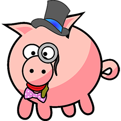 the transitions between all those elements, the size, the shapes, the colors and the visibility of those pieces. UX can even be how easy or difficult it is to find something or understand what they’re being asked to do.
Said another way, UI is the lipstick on the pig while the UX is the pig itself. If he’s slow or fat or he’s the perfect shade of pink all contribute to the experience you have with that pig. If the pig is dressed up in a cute hat, a bow tie, and a monocle, maybe you can overlook the slop dripping out of his mouth…or maybe you can’t.
The user interface is the lipstick on the pig while the user experience is the pig itself.

Get Started with Design
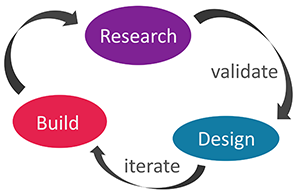 To begin your adventure of designing your interface, you want to dig deep into what others are doing. What’s trending? What’s typical in your industry or widely accepted across all verticals? Research > Design > Build, then repeat. Throughout the process make sure to constantly validate and iterate on your designs and assumptions. If someone says, “Everyone does it like this,” go back to your customer or target user and ask them if they do it like that, then ask 10 more! Data is your friend. Gather it!
Don’t Be Afraid of Color (or the lack of it)
Color can really make or break a design. Sometimes just changing a few shades or shifting tones can really make a huge difference. Adversely, so can the over use of color or, worse, clashing colors. It’s a fine balance. Color can be used to draw the eye or focus attention towards a call to action.
Color highlights important elements like links or titles; it can also set the tone for the page. Reds are exciting and bright, blues are calming and cool.
If you use lots of color all over the page, spread it out with lots of what the industry calls “white-space.” White-space is the empty regions between everything on the page, the padding, the margins, even the returns between paragraphs. White-space doesn’t have to be white, just noticeable and empty.
Color can be used to block off sections of a page or form to denote things that go together, but so too can white-space. A group of form fields can be blocked off with a colorful background, a border, or just a bunch of empty space. All these tactics work well to group like elements together.
Don’t Redesign the Wheel
Ok we have a pig, but we don’t know what it should look like. We know it needs some color, maybe some clothes, and definitely an attitude adjustment because no one likes a sloppy pig. How do we decide where to go from there?
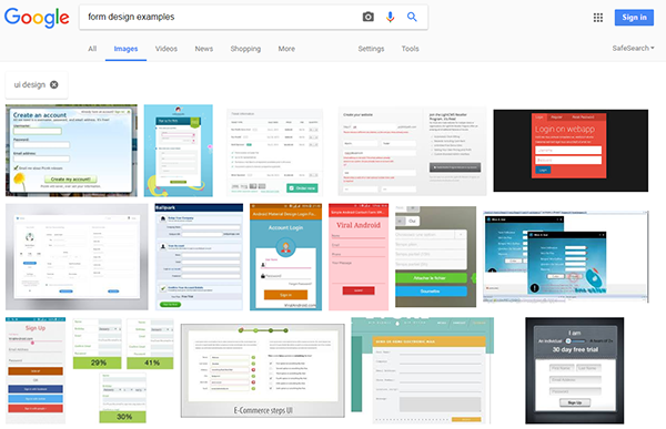
Google it of course! How else do you find the perfect pig? Chances are that if you’re building a site, a form, or a service catalog someone has done it before. So go see what they’ve done. A quick image search will return all kinds of cool layouts, interesting color combos, and maybe even some trendy new functionality you hadn’t even thought of yet. Find a few elements you like from those images and start designing with those. Then shop them around the office or (even better) with some of your target users.
Get Touchy Feely
Back to our pig, so we run a search and figure out dainty pink pigs are super popular right now. We find tons of images with piggy monocles and top hats, a few even have bow ties. Some people are even dyeing their pigs purple. I like purple so let’s try that!
First we try dyeing our pig purple and sticking a bow tie on it. He’s a little slow though, because someone stuck a tactical bullet proof vest on him. Can’t be too safe right? 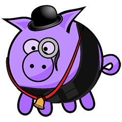 Our manager decided we should go with a bowler hat instead of a top hat because, well…the competition is doing it. Also, he has a bell because facilities would like to be able to hear the pig coming down the hall. Oh and the nice lady in HR thought he should have a monocle; it brightens her day to see him look so spiffy.
How do you feel about our overdressed, Fort-Knox-protected, super-slow purple pig? While everyone agrees the monocle is cute, the tactical vest seems a bit much. Its slowing down his progress around the office. Janice in accounting can’t stand the bell. She can’t add up all the money we’re spending on purple dye thanks to the incessant ringing. Facilities is also not excited about the dye; it clashes with the carpet, and he’s leaving a little purple trail.
If people aren’t enjoying their experience with your product they won’t want to keep using it. The experience literally has to feel good while immersed in it. Colors, fonts, page flow, pictures, and speed all contribute to how the experience feels.
When you hear people describe their likes or dislikes you’ll hear things like “it feels slow” or “it feels off” or even “I love how easy it is to search.” These are all feelings experienced because of your product.
Don’t Make Me Think
At the beginning of my career I read this fantastic book called Don’t Make Me Think by Steve Krug. The book is essentially a lot of “no-duh” tips, except that they’re so rarely followed! As you read, you realize you’ve missed so much of the mark you’re now dyeing pigs purple!
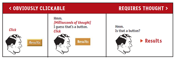
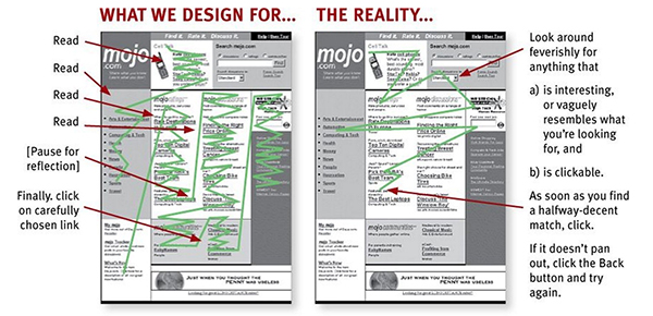
Your page layout should flow much like other pages do. Searches are prominent and easy to find. They’re located in places where people know where to find them. Forms aren’t overly cluttered, no one wants to fill out 100 fields just to click “Submit.” Text is easy to read, and headers are used to denote importance and not just for style. Links are easy to locate with underlines or a different color or font style. Buttons look like buttons. When you interact with elements they change so you give the impression of a tactile experience.
Tying this all together, we’ve validated that the bell is out—too annoying. We ditched the dye—too expensive and ugly. We quietly traded the bowler hat out for a top hat (no self-respecting pig wears bowler hats anymore). We kept the monocle everyone loved. 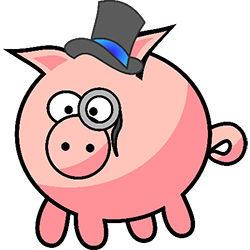 We liked the bow tie, but don’t have budget for it right now. We can add it later if someone complains. The last thing to go was the tactical vest. All that security was great, but no one really understood why our pig needed it in the first place. It was too confusing and made his progress way too slow.
What we have left is a tiny pink pig that zips around the office and is super cute to look at with his top hat and monocle.
Everything makes sense, no one is confused, and the experience is fast! Yay!
Take Your Content to Your Users
Your users are everywhere now-a-days—at their desks, on their phones, in the air (where I’m writing this article from right now), and at the coffee shop. Maybe your technicians or agents are on the go; maybe they’re running around the office or traveling between offices a lot. Take your content to your users. Ensure they can reach it from all the devices they use. Design not just for desktop screen sizes, but tablets and phones, too.
One of the biggest trends in tech is conversational interfaces. Mobile is great, but what if I just want to ask for help in Slack? Few people get the luxury of working in a single tool all day. Emails, phone calls, and messaging services all play huge roles in our day-to-day lives now. Build an integration to the tool of choice at your office.
For us, its Slack, so if I want to check the status of my ticket I submitted to IT maybe I just type “@IT what’s the status of my ticket?” Through an API, it can see that [Dani Renaud] has requested the [Status] of [most recent ticket]. In Slack @IT responds with “Ticket #1701D is currently Pending Investigation. It has been assigned to [Random IT Person].” Bonus points if it follows up with things you might want to do with that ticket, such as “Would you like to add a Comment?”
One of the last things I want to cover in this section is accessibility. Governments around the world are now mandating standards for people with visual and auditory disabilities. Don’t forget to make sure there are text alternatives to important audio pieces in your content, colors are visible to folks who might be color blind, font sizes can be adjusted, elements have a tab order set and that order is similar to the experience a vision capable person has, and lastly all elements on a page provide auditory feedback to a user who is navigating with a screen reader. If you’re interested in testing these elements, run through your stuff with a tool like NVDA or install an addon in Chrome like aXe.
The Perfect Pig
Wooo! That was a lot to take in. So how about some tools that can help you get the job done.
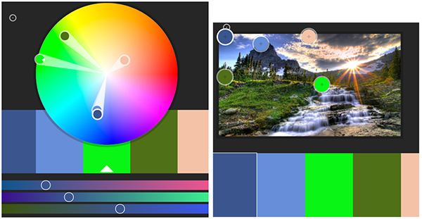
Color. Since color is huge I recommend Adobe’s Color Picker tool. You use the presents to get some basic matches to one or two colors you love or you can just upload a picture you like.
Layouts. Layouts are usually the next biggest challenge. If you’re looking to test out a few layouts without any design or color on top of it, Balsamiq is a beautiful tool for wireframing. There are plenty of others you can use, but I’ve always loved this tool for its simplicity in getting the layout across. Also, use Google! Search everything: “form layouts,” “portal website design,” and “designer pigs.”
Seriously, they have tutus and little rain boots!
Accessibility. Ok so this was already covered above, but for the “I just want to look at one place in the article” sake I’m repeating it down here. NVDA is a fantastic free tool for running through how easily a visually impaired person can navigate or understand what they’re diving into. aXe is an add on for Chrome that allows you to run a test on a webpage for accessibility support. A quick search will bring up plenty of other options for other browsers too, or you can just run through a webpage with NVDA turned on, too.
Getting to the perfect user experience is nearly impossible. Some elements of your designs will always have outliers who don’t like the experience or disagree with the look and feel. Your goal is to please 80% of your target users and make that experience as enjoyable as possible. I wish you much luck with your own lipstick-covered pigs.
Get your service management content in person at Service Management World!
Join us!
Dani Renaud is a product strategist with more than 10 years of professional UI/UX design experience. Her expertise spans web, mobile, and UI/UX design. She is certified in Pragmatic Marketing and ITIL Foundations and is a certified Scrum Product Owner. In her current position, Dani is responsible for guiding the development of Cherwell’s ITSM product, including defining requirements and design, and roadmap planning. Follow her on Twitter
@CherwellDani
, or sync up with her on
LinkedIn
.