Date Published September 15, 2020 - Last Updated September 15, 2020
When I first started reporting on ITSM data more than 15 years ago, I was limited by both technology and experience. From a technological perspective, the metrics I was able to produce were rudimentary at best. From an experience perspective, I didn’t know much about ITSM metrics. The reports I produced were like most any other service or logistic reporting: you had some dimensions and some measures, and you sliced and diced them against each other as out-of-the box as possible.
Since then I’ve drastically evolved my views on analytics. This evolution has been both eye-opening and humbling. I learned a lot, but some of the most important things I’ve learned aren’t about technologies or metrics, but how to ask better questions. To help understand that, we need to talk about evolution.
Like evolution, growing in visual analytical maturity revolves around two fundamental principles. The first is that there is a fundamental difference between the evolution of a visualization and the evolution of a question. You should not conflate the two, either in intent or process, and to properly evolve questions about either, both must be treated in isolation.
Good visualizations should provide insights but those insights are not end points; they’re jumping-off points to better questions.

Taking a basic bar chart, adding some visual best practices, providing better context, and adding interactivity (drill downs, aggregation changes, other actions, etc.) can certainly make improvements, but this does not mean that your questions are evolving. Likewise you can have the most insightful dashboards in the world, but if your questions never evolve past “How many tickets did Level 1 close this month?,” you’re wasting good time and resources. Good visualizations should provide insights but those insights are not end points; they’re jumping-off points to better questions.
The second principle is that anomalies by themselves have limited value. The metric showing the anomaly may look more valuable, but it has no more inherent value than it did the previous times you looked over it. If you’re building reports that are only valuable for the exceptions and not the rule, then you’re building bad reports. Another problem is that anomalies themselves, especially ones presented visually, are of little insight without context.
After establishing our two basic principles, let’s use them to walk through an example of report evolution. First, we’ll turn our principles into questions to answer:
- Does this change improve the visualization?
- Does this change enable a better question or insight?
- Does this change provide better context or enablement?
Think of these as your guiding principles for accepting or rejecting changes. Like real life evolution, some of the best advancements may come at random, but the important thing is to have something to judge it against to know if it's worth keeping.
Scenario: You run an ITSM call-center for ACME Corp. Due to expanding markets, leadership is looking to bring on a new sales team. However, they know they need the IT department to support the increased headcount. They want to review the ITSM volume to see if it can handle the new load while staying within budget. You’re assuming a 10% increase in volume for the new headcount, and know that tickets resolved on first call (FCR) cost half that of ones that don't have FCR. The new sales team will come out of the Seattle office, which has its own local helpdesk. Below are the columns available in your data, and your current dashboard. Can you address the needs of your execs with these? If not, what can you do to evolve so that you can?
Columns: Ticket ID | Category | Office Location (City) | Date Opened | Date Closed | Status | FCR Achieved? | Level Resolved At | Contact Method
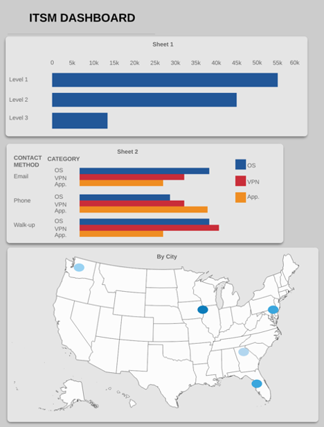
Looking at the above, do you think you could answer your executives? I can’t, and I do this for a living. Let’s filter this dashboard through our three questions and, considering the requirements of the scenario, see what we could improve.
Question #1: Does this change improve our visualization?
What changes could we make to improve this visually? Some obvious ones stick out:
-
Titles: Only one viz has them, and it’s not even very helpful. Add descriptive titles, and even subtitles for better context
-
Unnecessary use of color: In “Sheet 2,” we’re using both color and text to tell us what the category is. This may make the viz pop more with variety, but it’s unneeded and double-encodes the dimension (category). Remove the color; the text will suffice.
-
Eliminations: Speaking of “Sheet 2” ... is it really needed? Sure this data may be interesting, but it’s not what we’re looking for, is it?
-
Maps: Maps are a great tool, but they take up a lot of real-estate (no pun intended) on most dashboards. We really only care about Seattle, so one could argue we could eliminate the map altogether. If we decided to keep the map, how could we make sure to focus on Seattle appropriately?
Do you think any of the above would pass the test for Question #1? I do, so they’re potentially valuable changes.
Question #2: Does this change enable a better question (or insight)?
What questions could be answered by the viz presented? If our only question was, “How many tickets came into Level 1/2/3?” we may be OK, but that’s not the question we’re interested in. Furthermore, do we even have the data needed? Think about some of the questions we’d need to answer for this scenario:
- What’s our FCR, especially in Seattle?
- If we increased our volume by 10%, does that push us above our thresholds?
- Will we stay within budget?
We could maybe answer the first question by adding a metric for FCRs and some controlling filters by city, but that’s about it. We don’t have any data on thresholds, we’re not providing the ability to do IF/THEN analysis with percentage point increases, and we don’t have anything listed about budgets (or cost per ticket to see if we exceed them).
Question #3: Does this change provide better context or enablement?
Now let’s take this one step further; remember, we’re talking about the evolution of questions, not just about filling in new ones thanks to new data. Imagine we had those extra data points and could visualize them.
In our analysis we found that yes, assuming 10% increase, L1and L2 would stay under budget in Seattle, but L3’s increased volume would put us over budget. But through exploration, we found that the majority of L3 tickets all centered around one category, and none of those used the contact method of walk-up. You know that the longer a ticket stays open, the more it costs; digging deeper, you find that walk-up station tickets are solved faster than email and phone. You also found out that Seattle doesn’t have a walk-up station, but the metrics indicate they should – in fact, it’s the only way to stay under budget.
Now imagine that you can add this context to your viz, or enable your executives to come to that conclusion themselves.
Does this evolution pass the test? You bet - now you’ve gone beyond being descriptive about historical data to becoming prescriptive with new insights your execs didn’t even think to ask! You’re evolving into a real data evangelist here!
* * * * *
Evolution, like data visualization maturity, is never a straight line. You’ll make mistakes, back track, find new insights, and go off on tangents. It’s not the random occurrences that mean the most - it’s the principles that help guide the way and decide what is valuable. I’ve provided an example of some of the ones I use. The next time you’re presented with requirements for new insights or thinking about looking over you current dashboards and wondering if they’re providing you the insights necessary, try running any potential changes by these principles. Perhaps the insights you find will be (r)evolutionary.
Adam Rauh has been working in IT since 2005. Currently in the data analytics space, he spent over a decade working in IT operations focusing on data analytics, security, leadership, and infrastructure support. He is passionate about data, operations, process frameworks and methodologies. He has spoken at, contributed to, or authored articles for a number of conferences, seminars, and user-groups across the US on a variety of subjects related to IT, data analytics, and public policy. He currently lives in Georgia. Connect with Adam on LinkedIn.